Saturday, March 30, 2013

कुछ लोग

खो गये कुछ लोग भूली बिसरी यादों में,
कुछ पुराने नगमे जैसे, अनसुलझे सवालो में,
वो पीली किताब से झाँकते मुरझाए गुलाब की तरह,
चले गये जीवन से एक बदहवास से एहसास की तरह,
जो कहा करते थे की तुम्हारा साथ कभी ना छोड़ेंगे,
उनकी तो यादें भी कितनी बेवफा निकली...


Thursday, March 28, 2013

ITBA lab Session # 10 - 26 March 2013

#this post is created as a solution for assignment for IT & Business Applications Lab, Spring Semester, VGSoM, IIT Kharagpur Class of 2014

Topic:
3D plotting in R

Assignment:1
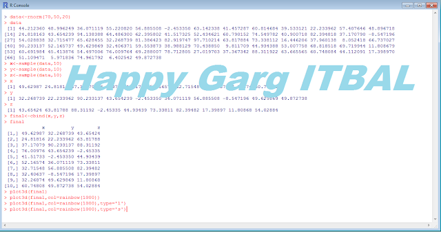
Create 3 vectors, x, y, z and choose any random values for them, ensuring they are of equal length, bind them together.Create 3 dimensional plots of the same.

Solution 1:


plot3d(final)


plot3d(final,col=rainbow(1000))


plot3d(final,col=rainbow(1000),type='l')


plot3d(final,col=rainbow(1000),type='s')


Assignment no:2 
Choose 2 random variables 
Create 3 plots: 
1. X-Y 
2. X-Y|Z (introducing a variable z and cbind it to z and y with 5 diff categories)
3. Color code and draw the graph 
4. Smooth and best fit line for the curve 

Solution 2:

 qplot(x,y)

qplot(x,z)


qplot(x,z,alpha=I(1/20))


qplot(x,y,geom=c("boxplot","jitter"))


qplot(x,y,colour=z)


qplot(log(x),log(y),colour=z)


Friday, March 22, 2013

ITBA lab Session # 9 - 19 March 2013

#this post is created as a solution for assignment for IT & Business Applications Lab, Spring Semester, VGSoM, IIT Kharagpur Class of 2014.

Data Visualization and Info graphics

Data visualization is the study of the visual representation of data, meaning "information that has been abstracted in some schematic form, including attributes or variables for the units of information".

According to Friedman (2008) the "main goal of data visualization is to communicate information clearly and effectively through graphical means.

It doesn't mean that data visualization needs to look boring to be functional or extremely sophisticated to look beautiful. To convey ideas effectively, both aesthetic form and functionality need to go hand in hand, providing insights into a rather sparse and complex data set by communicating its key-aspects in a more intuitive way. Yet designers often fail to achieve a balance between form and function, creating gorgeous data visualizations which fail to serve their main purpose — to communicate information"

There are several benefits of using infographics as stated by these infographics below:


Tool Analysis :  Visual.ly: (http://visual.ly/)

About:


Visual.ly is a community platform for data visualization and infographics. It was founded by Stew Langille, Lee Sherman, Tal Siach, and Adam Breckler in 2011.

Visual.ly is structured as both as a showcase for infographics as well as a marketplace and community for publishers, designers, and researchers. The site allows users to search images through description, tags, and sources in a variety of categories, ranging from Education to Business or Politics.Users can publish infographics to their personal profile, which they can subsequently share through their social networks.

Visual.ly maintains a team of data analysts, journalists, and designers that create infographics and data visualizations using the Visual.ly tools. They are currently developing a tool that allows anyone to create and publish their own data visualizations.Through this tool, users will be able to gather information from databases and APIs in an automated service to produce an infographic. Visual.ly’s first tool, the Twitter Visualizer tool allows users to input the Twitter handles of two people, and then generates an infographic comparing the hobbies, number of followers and occupation of the two accounts.

Visually is a one-stop shop for the creation of data visualizations and infographics, bringing together Marketing Gurus, Data Nerds and Design Junkies based on shared interests. Visually Marketplace introduces ecommerce and project management into the Visually platform, making it easier than ever for buyers and sellers of infographics to get them made, distributed, liked, commented on, and shared.

By tapping into Visually's vibrant community of more than 35,000 designers, Marketplace is able to match infographic commissioners – brands, companies, agencies – with designers, Once matched, commissioners have direct access to the designers working on their projects and can communicate and transact with them in Visually's Project Center. Through such unique features as the Project Timeline, commissioners always know where their project stands and can ensure that it stays on time and on budget.

Visually partners with the world's leading publications and brands, bringing  tools, community, and talented team to bear data visualization needs, wherever bespoke creation is needed.

Visual.ly is a great tool for businesses as well as individual, Visual.ly can be used to create visual resumes, Google analytics reports, venn diagrams, Facebook and twitter tools, brand management tools etc. I used visual.ly in a few ways the infographics of which I am posting here.

This is how I used visually to create insights for Vinculum-Annual VGSoM day's Facebook page and my personal Facebook profile as well:


Isn't it an amazing tool and when you thought its just about fun, behold. I created my brief visual resume by connecting it to my LinkedIn account in a matter of seconds. See how it looks.


There are several other options for creating resumes and many themes are given in the tool. The biggest asset of Visual.ly is probably the market place where you can use it by paying the fees to create your own brand identity and brand image. This means that it will solve all the advertising related needs of a brand which takes up substantial amount of time for any organization.

Since the resulting resume was not up to my expectations I also tried few other sites for the same, and found that their are may other portals which expertise in creating your visual resume in a matter of minutes. A few such portals which I actually tried were:

http://www.zeebly.com/ (for analysis of your facebook data)
http://re.vu/ (creating a visual resume, can upload from linkedin and also add your own data)
http://www.visualcv.com/ (for creating a visual CV, however this portal had poor infographic selection)

Here, is a really interesting infographic about Colour Psychology in Logo Design, this infographic can immensely help marketing & advertisers to think these dynamics while designing the logos for their brand. The brand message should translate in the colour of the logo.

Color Psychology in Logo Design

To, conclude the post I would say that infographics are tools that would drive the business in the future, the business would stop thinking of infographics just as an aesthetics measure and would want to translate their work from voluminous and boring reports to more easy to grasp infographics.

It is to provide the reader with a better sense of visualization by employing his/her more senses than usual. I would not be surprised to in the coming years, to see the annual reports of the company as a series of pictorial infographics which not only causes the target audience to actually read them but will also save them the wrath of being added into another pile of trash.

References:
http://blog.hubspot.com/blog/tabid/6307/bid/32255/Why-Marketers-Should-Invest-in-Visual-Content-Creation.aspx
http://switchedonmedia.com.au/blog/could-your-business-benefit-from-an-infographic/
http://www.wikipedia.com
http://visual.ly/

Here are few links where details about popular data visualization tools can be found out:
http://www.netmagazine.com/features/top-20-data-visualisation-tools
http://www.computerworld.com/s/article/9214755/Chart_and_image_gallery_30_free_tools_for_data_visualization_and_analysis
http://www.creativebloq.com/design-tools/data-visualisation-712402
http://www.teachthought.com/technology/5-free-data-visualization-tools-you-can-use-in-the-classroo/
http://itlyderis.wordpress.com/2013/03/05/22-free-tools-for-data-visualization-and-analysis-pcworld/


Tuesday, March 12, 2013

Vinculum'13: 2nd Annual VGSoM day

Vinculum, as the name suggests, symbolizes the bond between the VGSoM and IIT Kharagpur fraternity.

Vinculum is the cultural fest organized under the brand of the Vinod Gupta School of Management, to bring together various departments of IIT Kharagpur, professors, students of VGSoM MBA and EMBA course, as well as the alumni to share some quality time with us, it helps us in gaining popularity, recognition & also strengthen our relationship with other departments.


IIT Kharagpur is a unique campus that represents quality and diversity in the field of education, where the best brains from various parts of India come to pursue their dreams of becoming engineers, scientists, academicians, lawyers and managers.


Vinculum – the cultural festival of VGSoM celebrates the spirit of the school of management of IIT Kharagpur by bringing together people from diverse educational backgrounds on the same podium.


Vinculum which began with this idea in 2012 was a huge success. With the marathon that saw massive participation from different departments of IIT and the overwhelming response to the guest lecture by the much celebrated Mumbai Dabbawallas who redefined quality in the service sector, it can be said that the purpose of Vinculum was well served.


"Coming together is a beginning, keeping together is progress, working together is success"

-Henry Ford

VINCULUM 2013 reinforced the facets that were explored in 2012. It was held on 8th and 9th of March 2013. Vinculum began on the evening of 8th March with Cult Night, there were awesome song, dance, skit performances not just by the students of both the batches but also by the professors. There were events like classical dance, western dance, Harlem shake, Bangla one act skit, singing performances etc. The event was woven around International women’s day, and there was a cake cutting ceremony for the women of VGSoM. The cultural program was followed by a sumptuous dinner in the VGSoM foyer and a makeshift DJ for the students.


The next day promised more fun and enthusiasm and it truly lived up to the expectations. The day began with a Marathon that was open for each and every member of the IIT Kharagpur family; the 4.4 km run began at Gymkhana and ended at VGSoM, the students, professors and support staff participated in the event by waking up in the wee hours of the morning and wholly supporting an important cause of Women empowerment. T-Shirts were given to the first 40 people who completed the run and certificates to the winners in 3 categories namely boys, girls and faculties.

The next event in line was the PAN IIT Inter Departmental quiz. It was a resounding success, the participation increased from 14 to 20 this year.

The quiz master was Mr. Anubhav Mukherjee and Mr. Anurag from Kolkata, they came up with umpteen number of challenging questions which really tested the ace quizzers of IIT Kharagpur to the maximum limit.

The team of (Arman Sharma and Ajay Vishwanathan) from Electronics and Electrical Communication department won the coveted trophy for 2nd time in a row.


Vinculum’13 reached its pinnacle with the Voice of Women: Women’s Summit, eminent women leaders, entrepreneurs from the corporate and other walks of life participated in the same. The topic of the discussion was Indian Women – Architects of Change and Icons of Sustainability.

The panel comprised of the following speakers:

Ms. Archna Wadhwa, Global Service Delivery Head of Production Management Solutions, HSBC
Ms. Geetha Vishwanathan, Educationalist &MD, Srijati Institute of Fashion  Technology
Ms. Subha Rajan, Director of External Affairs, CII
Ms. Parvati Tampi, Communication Specialist & Former Miss India Finalist
Rtn. Indrani Gupta, Head, Rotary Club, Kolkata Zone

It was moderated by Prof. Anita Sarkar from XLRI Jamshedpur

They shared their thoughts on women empowerment in India and also told their success stories, the event was a grand success with immense learning and knowledge enhancement for the audience.


There were other fun events in Vinculum’13 like the Treasure hunt and Counter Strike; these events provided the budding managers of VGSoM with the much needed fun and enjoyment, and also a chance to prove their acumen in some mind boggling challenge.

Vinculum’13 was driven by the Student Council of VGSoM and supported by other committees like Sportcomm, Quiz Club, Cultcomm and CMI and also each and every student of VGSoM contributed towards the success of the event in their own capacity. Vinculum went away with the promise of coming next year even bigger & better.It gave immense learning to all its stakeholders.


“Ideas generate, when we challenge our boundaries. But, when we break them, miracles happen”.


Image Credits: Sandeep Katakol & Divij Sharma


ITBA lab Session # 8 - 12 March 2013


#this post is created as a solution for assignment for IT & Business Applications Lab, Spring Semester, VGSoM, IIT Kharagpur Class of 2014.
Panel Data Analysis of "Produc" data

We will be analyzing on three types of model
:

      Pooled affect model
      Fixed affect model
      Random affect model

Then we will be determining which model is the best by using functions:

       pFtest : for determining between fixed and pooled
       plmtest : for determining between pooled and random
       phtest: for determining between random and fixed

Commands:

Loading data:
> data(Produc , package ="plm")
> head(Produc)


Data

Pooled Affect Model

> pool <- br="" data="Produc," emp="" gsp="" hwy="" index="c(" log="" model="(" pc="" pcap="" plm="" pooling="" state="" unemp="" util="" water="" year=""> > summary(pool)

Pooled Affect Model


Fixed Affect Model:

> fixed <- data="Produc," emp="" gsp="" hwy="" index="c(" log="" model="(" pc="" pcap="" plm="" span="" state="" unemp="" util="" water="" within="" year="">
> summary(fixed)


Fixed Affect Model

Random Affect Model:
> random <- data="Produc," emp="" gsp="" hwy="" index="c(" log="" model="(" pc="" pcap="" plm="" random="" span="" state="" unemp="" util="" water="" year="">
> summary(random)


Random Affect Model

Comparison

The comparison between the models would be a Hypothesis testing based on the following concept:

H0: Null Hypothesis: the individual index and time based params are all zero
H1: Alternate Hypothesis: atleast one of the index and time based params is non zero

Pooled vs Fixed

Null Hypothesis: Pooled Affect Model
Alternate Hypothesis : Fixed Affect Model

Command:
> pFtest(fixed,pool)

Result:

data:  log(pcap) ~ log(hwy) + log(water) + log(util) + log(pc) + log(gsp) +      log(emp) + log(unemp)
F = 56.6361, df1 = 47, df2 = 761, p-value < 2.2e-16
alternative hypothesis: significant effects
Since the p value is negligible so we reject the Null Hypothesis and hence Alternate hypothesis is accepted which is to accept Fixed Affect Model.


pFtest

Pooled vs Random

Null Hypothesis: Pooled Affect Model
Alternate Hypothesis: Random Affect Model

Command :
> plmtest(pool)

Result:

        Lagrange Multiplier Test - (Honda)
data:  log(pcap) ~ log(hwy) + log(water) + log(util) + log(pc) + log(gsp) +      log(emp) + log(unemp)
normal = 57.1686, p-value < 2.2e-16
alternative hypothesis: significant effects

Since the p value is negligible so we reject the Null Hypothesis and hence Alternate hypothesis is accepted which is to accept Random Affect Model.

plmtest

Random vs Fixed

Null Hypothesis: No Correlation . Random Affect Model
Alternate Hypothesis: Fixed Affect Model

Command:
 > phtest(fixed,random)

Result:

        Hausman Test
data:  log(pcap) ~ log(hwy) + log(water) + log(util) + log(pc) + log(gsp) +      log(emp) + log(unemp)
chisq = 93.546, df = 7, p-value < 2.2e-16
alternative hypothesis: one model is inconsistent

Since the p value is negligible so we reject the Null Hypothesis and hence Alternate hypothesis is accepted which is to accept Fixed Affect Model.


phtest

Conclusion: 

So after making all the comparisons we come to the conclusion that Fixed Affect Model is best suited to do the panel data analysis for "Produc" data set.

Hence , we conclude that within the same id i.e. within same "state" there is no variation.

Monday, March 04, 2013

Digital Divide and Digital Noesis

#this post is created to facilitate class discussion on the topics of Digital Divide and Digital Noesis as a part of the assignment for WBC course, Spring Semester, VGSoM, IIT Kharagpur Class of 2014

A digital divide is an economic inequality between groups, broadly construed, in terms of access to, use of, or knowledge of information and communication technologies. The divide inside countries, such as the digital divide in the United States, can refer to inequalities between individuals, households, businesses, and geographic areas at different socio-economic and other demographic levels, while the Global digital divide designates countries as the units of analysis and examines the divide between developing and developed countries on an international scale.

“Digital Divide” also refers to the gap between those who can benefit from digital technology and those who cannot. ”Closing the Digital Divide” therefore means more than just giving the poor the same technologies already received by the rich. Closing the Divide involves restructuring the telecommunications sectors in each nation so that broadband’s benefits can flow to the masses, not just the elite urban sectors of emerging markets.


"Digital Noesis" studies how digitization and digital technology affect human “knowing.” Using spoken language as the base, technologies such a writing, print, and electronically mediated communication affect the manner in which humans know themselves and their world. Digital noesis studies this process.


References used:


http://www.digitaldivide.org/digital-divide/digitaldividedefined/digitaldivide.html

https://portfolio.du.edu/portfolio/getportfoliofile?uid=5742

http://en.wikipedia.org/wiki/Digital_divide

Please pour in your comments.